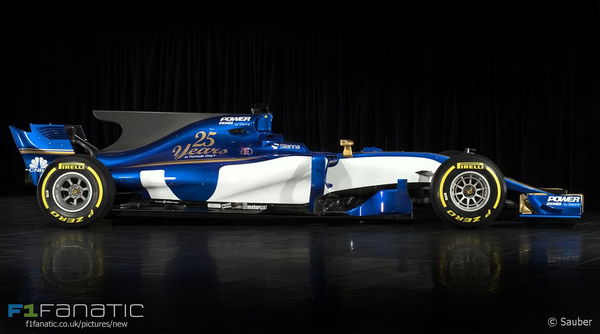

The 2017 cars are beginning to make their way to us and after Willaims jumped the cue and released an animation of FW40 on Friday unannounced, Sauber stuck to its date and finally revealed its 2017 challenger.
Let’s take a look without further ado:
ADVERTISEMENT
Article continues below this ad

Gone are the last two year’s blue and yellow Banco de Brasil livery and in place there’s a blue and white color scheme with golden highlights that give a car a different look, to say the least. It looks much better than the team’s last year iteration and with improved finances Sauber could turn out to be this year’s dark horse in the midfield. The Sidepods differ in their approach compared to William’s and while the Grove based team had a longer and low slung sidepods, Sauber has firm ones but they sweep aggressively towards the engine in the end. The openings are smaller too and the reason is clear in the image below as the main inlet is a split style fulfilling two duties of cooling the engines and radiators in the sidepods.

For 2017 the tires are bigger and despite the increase in the dimensions of the car, the tires do look bigger in proportion to the car despite the same rim size of 13 inches. The low rear wing does give the car a sleek and fast look and the returning shark fin engine cover is sure to split opinions. At the front, the bigger bargeboards look really beefy and curvy and that area is primed to be an area for teams to try different things to gain that elusive 1/10 of a second.

Sauber’s livery is not only different from last year but it’s also interesting for the Swiss team. 2017 marks 25 years of presence in the Sport for the independent team and it’s no less a feat given how bigger names have not been able to stand for half that time despite their deep pockets. Sauber has seen a lot during these 25 years from humble beginnings to a

But what hurts looking at the images is the lack of sponsors and a title sponsor for Sauber and given the high cost of running in F1 and the team’s weak finances I hope the team finds more sponsors to avoid a fate similar to Manor because if that does happen then it’ll be a shame and loss for the Sport.
ADVERTISEMENT
Article continues below this ad
The 2017 cars do look like those of the 2002-2003 but not overall. The back side does remind you of cars of the era gone by however the front continues to disappoint and both Williams and Sauber’s car show that the regulation makers failed to get rid of thumb tip style noses in order to increase the visual appeal of the cars.

ADVERTISEMENT
Article continues below this ad
Mind you these are mere pictures with the actual reveal of the C36 slotted for 22nd of Feb and only then we’ll know how the car looks like in person.
ADVERTISEMENT
ADVERTISEMENT
ADVERTISEMENT
ADVERTISEMENT

