
There have been a lot of gimmicks over the years that have absolutely killed it in the merchandise section of the WWE store. The company makes a huge profit off of these sales in T-Shirts, ring-gear replica, collectables, action figures, and other apparel. A huge contributor to this revenue is Roman Reigns.
“The Big Dog”, ever since being established as the face of the company, has seen a spike in merchandise sales. He is very popular still amongst the young crowd as well as the new generation of WWE fans that are taking over the demographic.
ADVERTISEMENT
Article continues below this ad

The main feature of Reigns’ gear that is also recurring is his logo. There has been a lot of speculation over what the logo means. It looks like a spider, resembling the Spiderman suit, but also manages to stand out on its own.
As you can see above, the ‘R and R’ is pretty simple to understand. It stands for Roman Reigns. But what about that spike in the middle? The spike has been the topic of discussion to numerous WWE fans over the years.

Roman Reigns may have been inspired by Jeff Hardy…. or Spiderman
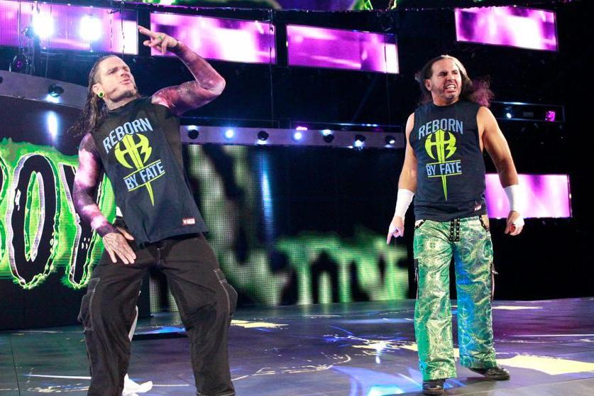
The logo as a whole looks a lot like Jeff Hardy’s back when he teamed up with his brother Matt in WWE. It is possible that a young Roman Reigns drew inspiration from this concept and had his logo feature a similar shape and layout.

A bigger theory that has gained heat is that the logo was inspired by the Spiderman classic suit logo. A recurring symbol of the red and blue superhero, the Spider has been a trademark of one of Marvel’s best characters.
However, the most sensible theory is that the logo forms a sort of diamond shape that resembles a shield when looked at from a distance. This is reminiscent to Roman’s first gig on the main roster as a member of The Shield.

The Shield has a big role to play in the logo
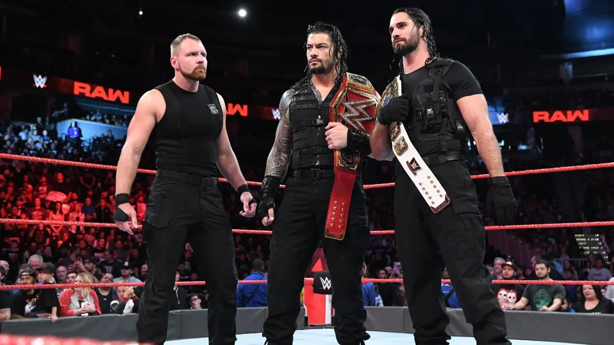
“The Big Dog” conquered the main roster through wolf-pack like attacks on Superstars along with Dean Ambrose (Jon Moxley) and Seth Rollins. All there NXT recruits made their main roster debuts through this gimmick.

They used their superior numbers to conquer opponents stranded at the centre of the ring. The Shield will never be whole again now since Ambrose now wrestles for AEW under the ring name Jon Moxley.
There is a huge observation that Reigns’ character never truly moved on from The Shield. This is mainly because he never changed his ring attire after the team split up twice!

His gimmick and character were also essentially the same. Only in late 2020, he debuted as a heel and changed his ring attire, losing the chest guard. However, “The Big Dog” still retains the logo, probably as a stark reminder of who he first was, and who he always will be as a character.
The Spike means something simpler than you think
The spike in the middle of the two Rs has been another dilemma. No one knows the symbolism of it, and Reigns himself has not spoken about it. We have no idea who created the logo so there’s no one to ask about it.

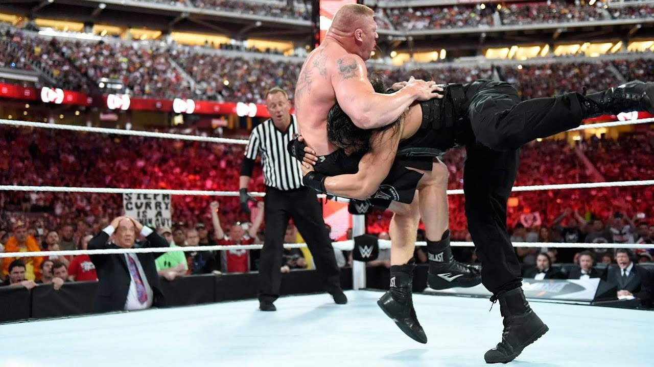
There is a possibility that the spike is a stake or a memento of his victory over The Undertaker at WrestleMania. The stake is something used to kill a vampire or an evil being. Since Taker was “The Deadman”, it makes sense.
ADVERTISEMENT
Article continues below this ad
The most viable conclusion is that the stake is actually a Spear, which is the finishing move of Roman Reigns. The Spear goes well with his gimmick of the Roman Empire and he has put down every opponent with that move.

ADVERTISEMENT
Article continues below this ad
It’s unlikely that Reigns will ever change this logo since it has become a trademark for his merchandise sales. Reigns has already achieved what many Superstars haven’t throughout their entire career. He is set to become one of the greatest and will undoubtedly persevere to reach there.
ADVERTISEMENT
ADVERTISEMENT
ADVERTISEMENT
ADVERTISEMENT

