
Novak Djokovic is one of the most well known at least in the world let alone the world of tennis. He is one of the most marketable players in the entire tennis fraternity and given his continued success in the tour his image and brand is in high demand.
Watch What’s Trending Now!
We have seen many top players come up with a logo to be associated with their personas. The top tennis stars today all seem to have special logos for themselves, which they use on their gears, apparel and other merchandise.
For this purpose, almost all major stars create logos with great help from professionals that help to put across their personality in the best way possible. This is even more true in the case of the Serb who has used a great deal of hidden symbolism in his logo.
ADVERTISEMENT
Article continues below this ad
When was the logo launched?
ADVERTISEMENT
Article continues below this ad
Novak Djokovic launched his logo in 2012. He also uploaded a video about it on his official YouTube channel. That is how his countless fans and supporters are enlightened about the deeper meaning behind Djokovic’s logo. The video which starts with the sentence “The greater the challenge the more the glory in overcoming it” has 205k views on it.
What is Novak Djokovic’s logo?
There are several players in the circuit, who have created logos to go with their identity and brand as a player. All of them seem to have a theme or a thought regarding how the stars want their images to be recognised. For example, Rafael Nadal’s logo is a stylised outline, which is a reflection of a raging bull, as he is often nicknamed on the court. Roger Federer’s however is his trademark RF, which while simple is still extremely classy and pleasing to the eye.
Djokovic’s logo on the other hand, is quite layered and has manifold associations. There are three basic elements to the logo, as is explained in the video.

USA Today via Reuters
Sep 8, 2021; Flushing, NY, USA; Novak Djokovic of Serbia reacts after winning a game against Matteo Berrettini of Italy (not pictured) on day ten of the 2021 U.S. Open tennis tournament at USTA Billie Jean King National Tennis Center. Mandatory Credit: Geoff Burke-USA TODAY Sports
The first association is with that of the Greek that are Alpha. Alpha is the first letter of the Greek lexicon.
The Serbian star is also deeply connected to his roots having grown up in a war-torn Serbia. His is national identity is pride to him. So, his logo is an homage to Serbian traditions, as it looks like medieval Serbian initials. The Djoker has always shown his attachment to his culture, and this is another example.
The third aspect of the logo is that artistically it looks like birds. That is why picturization is essential to note.. If you look closely, it looks like a flying bird and Djokovic wants to use that visual to signify an aspiration for dreams and freedom.
Also read: Why Does Novak Djokovic Eat Grass at Wimbledon Championships
What does Novak Djokovic’s logo signify?
Djokovic has always been a proponent of dreaming big considering his humble roots. The Serb seeks to use his logo to convey the same feeling. His logo is not just a branding mechanism for the Serbian star. It goes beyond that, as it is something closely related it to his value systems and holds great meaning for him. The logo is aimed to imply a go-getter, winner mentality, attempting to soar great and greater heights. Novak Djokovic’s logo might look complicated at a glance but it is actually quite thoughtful and unique.

via Reuters
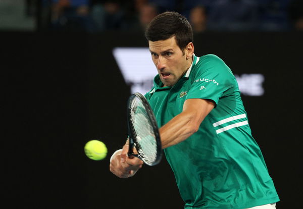
Tennis – Australian Open – Melbourne Park, Melbourne, Australia, Serbia’s Novak Djokovic in action during his first round match against France’s Jeremy Chardy REUTERS/Loren Elliott
Traditionally, tennis stars have given great importance to their logos. These become a part of their personal brand in the modern world. The needs of the modern industry require a tennis star to maintain their personality in a way that it becomes marketable. It is really amazing to see Novak putting so much effort into his logo. This certainly shows that he likes to put meaning behind all his actions.
Who designed Novak’s logo?
It is clear from the design of the logo and the hidden meaning behind it that Djokovic himself has been heavily involved in the design. However, as is acknowledged in the video as well, he worked together with PRpepper, to release the official video celebrating their new logo and explaining its meaning.

via Reuters
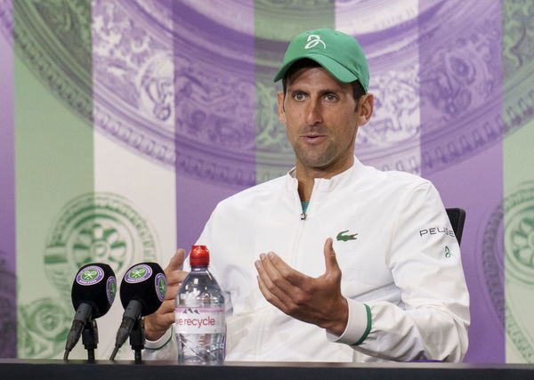
Tennis – Wimbledon – All England Lawn Tennis and Croquet Club, London, Britain – July 9, 2021 Serbia’s Novak Djokovic attends a press conference Pool via REUTERS/Joe Toth
He spors clothing with his logo on it, sponsored by Lacoste, at press conferences, interviews, social commitments as well as on the court. The logo is also seen on his shoes, and sometimes on his caps too. His team too wears his merchandise, both while in the player’s box, as well as while training with him on-court.
What does his logo look like?
The official video goes on to show exactly how Djokovic and his team came up with the design of the logo. It also reveals how the different elements are hidden in a very subtle way in it. It also elaborates on the typography used to create the logo, which looks like a very stylized DN standing for his own initials, but also has an inner meaning.
The fact that he released the video to help his fans understand the true meaning is part of the reason why his e loyal fan base connects with him on a different level.

via Imago
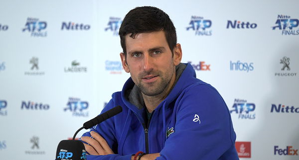
Novak Djokovic
After the video ends, and the credits to the agency roll, there is a short cameo by the Serb himself. He is seen hugging a tree and showing a thumbs up towards the camera saying “hope you like it, enjoy!”
ADVERTISEMENT
Article continues below this ad
It does a good job of representing the personality of Djokovic, who considers himself a seeker. One who is searching for the truth. That’s his spiritual nature, he has reiterated time and again.
Read more: Novak Djokovic 2022 – Net Worth, Salary and Endorsements
ADVERTISEMENT
ADVERTISEMENT
ADVERTISEMENT
ADVERTISEMENT

