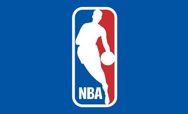

“You deserve to be The Logo,” Shaquille O’Neal wrote in the eulogy for the late Jerry West. For a long time, the Lakers legend was associated with the logo. Many believed that it was inspired by an iconic image of the 1969 NBA Finals MVP. The logo featured a silhouetted image of a faceless player dribbling a ball against the red and blue background. It was introduced to the world in 1969. And despite some minor changes in 2017, the iconic logo has remained unchanged to this day. But what was present before that?
Here is everything we know about it and how all these make the logo inspired by West so important.
ADVERTISEMENT
Article continues below this ad
The first NBA logo
Don’t be surprised, the first NBA logo is quite different from the one it flaunts now. Rather than a player, the logo focused solely on the organization. Featuring a white circular background, it had two green arched lines drawn at the top and bottom with the words “National Basketball Association” embossed in uppercase letters and red.
While “National” and “Association” were placed at the top and bottom, appearing curved along with the lines, “Basketball” was placed at the center against the curve. This was their first attempt to dominate globally. Just three years after the first logo, the organization decided to bring in a change.
NBA went all minimal in its second and third logo
The second NBA logo featured a red basketball. The letters “NBA” were in uppercase while black lines were marked on the top and bottom. This logo remained in use until 1962. In that year, the logo again underwent a complete redesign.
The basketball emblem became gray in color, maintaining a circular or similar shape to the earlier one. The letters “NBA” were embossed on it in black and positioned diagonally from the top left to the bottom right. Well, this one was quite successful and stayed with the organization for 7 years.
In 1969, the league felt the need to make a significant change that would go on to have the global impact it now enjoys.
Did Jerry West inspire the NBA logo?
This logo this time focused on the player. As mentioned at first, a player’s image garners attention while the letters “NBA” in uppercase letters are placed below. The shape was also changed with it being rectangular and rounded in the corners. The founder of Siegel+Gale, Alan Siegel was hired to design this logo.
View this post on Instagram
While the league has never officially confirmed it, the designer of the logo and many others have confirmed that it was inspired by West. It was Siegel who confirmed in a conversation with MarketWatch, about a picture West from a sports magazine influenced the logo. “I thought, ‘I’m tired of people doing symbols with hook shots.’ I wanted to do something that was graceful,” Siegel said. The designer detailed that he was paid $14,000 for the job.
The sudden passing of West on June 12, 2024, shook the entire basketball world. “You deserve to be The Logo, but to all of us who had the honor of knowing you, you were so much more. With all of your nicknames — Mr. Clutch, Mr. Outside, or even Zeke from Cabin Creek — they still don’t capture the man that you were. But, I have a final label for you. And I am so proud that I got to call you this. Friend,” Shaquille O’Neal said.
ADVERTISEMENT
Article continues below this ad
As we mourn the loss of the late Los Angeles Lakers legend, we reflect on the contributions he made to the league. The logo also serves as a powerful reminder of his impact.
Stay tuned for more such updates, and to follow what Shaq’s ex-agent, Leonard Armato, has to say about the Reese-Clark rivalry and more, watch this video.
ADVERTISEMENT
Article continues below this ad
ADVERTISEMENT
ADVERTISEMENT
ADVERTISEMENT
ADVERTISEMENT

