via Imago
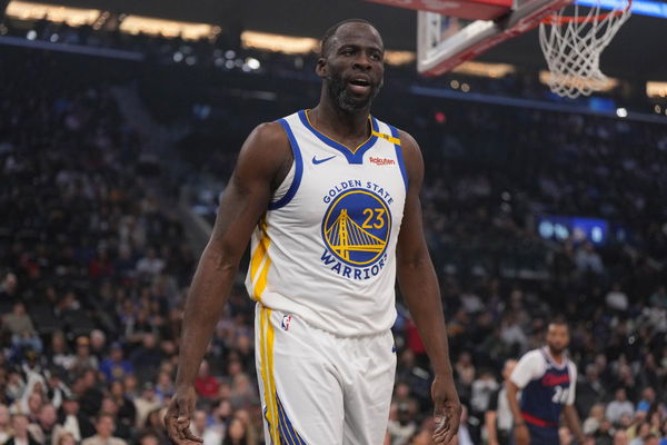
Nov 18, 2024; Inglewood, California, USA; Golden State Warriors forward Draymond Green (23) reacts in the first half against the LA Clippers at Intuit Dome. Mandatory Credit: Kirby Lee-Imagn Images

via Imago
Nov 18, 2024; Inglewood, California, USA; Golden State Warriors forward Draymond Green (23) reacts in the first half against the LA Clippers at Intuit Dome. Mandatory Credit: Kirby Lee-Imagn Images
The Houston Rockets suffered a narrow 99-93 defeat to the Golden State Warriors, struggling with inefficiency and defensive lapses. Golden State’s precision off-ball movement created problems for Houston throughout the game. Jonathan Kuminga had a standout performance, dropping 33 points on 13-of-22 shooting. This marked his best game of the season by far, showcasing his growth and ability to step up when the Warriors needed him most.
With Curry and Draymond both on the bench in sweats Thursday, the Warriors were forced to find alternative sources of offense. It was a must-win to break their season-long losing streak and continue their historic run against the Rockets. But Green still turned heads while on the bench.
It wasn’t just sweats he was wearing. He was repping the Golden State Valkyries new jersey. The Explorer Edition jersey comes in bold black, with a bright violet logo standing out. Violet numbers are displayed on both the front and back, paired with crisp white stripes.
ADVERTISEMENT
Article continues below this ad
In October 2023, Joe Lacob and Peter Guber, the Golden State Warriors’ owners, secured rights to a California Bay Area team by paying a $50 million expansion fee. Their investment marked a bold move into the region, adding another layer of intrigue to the NBA landscape.
Nike and the Golden State Valkyries have unveiled the WNBA expansion franchise's first uniforms 🪡 pic.twitter.com/UQ5bSviHGH
— Front Office Sports (@FOS) December 5, 2024
The fans don’t seem to like the jersey and took to X to voice their opinions.
Draymond Green’s repping the Valkyries did not sit well with the fans
One fan just straight-out said “The jersey sucks.” the NBA and the WNBA are one of the last leagues where sponsors haven’t completely taken over the jersey. The team name in a simple font has been the gold standard. But this jersey tries to be loud. A huge logo that isn’t sitting well with the fans. Plus the number placement is off-center to the right, which isn’t appealing visually and throws off viewers.
“those sponsors though… soon jerseys going to look like F1 team gear” said a netizen. The purpose of the jerseys is for easy identification of the player and other reasons. They’re not supposed to be a walking billboard. But sponsors have taken over this jersey. This undermines the team’s name. But since the sponsors shell out a lot of money to get their brand name on it, sponsors take over the jersey. Money has always been the biggest motivator.
ADVERTISEMENT
Article continues below this ad
One user made fun of the huge sponsor placement. “Is this the golden state valks or the Kaiser permanente?” they wrote. The Kaiser Permanente is taking way too much space and is directly beneath the logo. It also has a white color, which contrasts with the rest of the jersey. The contrast can make it confusing. Many can be led to believe that is the Kaiser Permanente team.
“i hate wnba jerseys so much it looks so generic” said another user. While the WNBA hate is strong with this one, the jersey looking generic is true. The logo feels like something the Vought Corp from The Boys would design. There is no uniqueness to it. Their identity seems to be lost. Plus, with the sponsors’ placement, the whole point of the jersey feels moot.

via Imago
Dec 5, 2024; San Francisco, California, USA; Sidelined Golden State Warriors guard Stephen Curry (30) and forward Draymond Green (23) and other players on the bench react after a teammate scored against the Houston Rockets during the fourth quarter at Chase Center. Mandatory Credit: John Hefti-Imagn Images
Another fan pointed out something amusing “Logo that small on the jersey makes me realize we can make the Valkyrie V with our hands”. The team’s logo is a mix of the Bay Bridge and wings, combining two symbols that show the Valkyries’ strength. The design transforms the bridge’s suspension cables into wings. Well, you certainly can make the Valkyrie V with your hands. Imagine the whole stadium making V signs with their hands to support the Valkyries!
ADVERTISEMENT
Article continues below this ad
So what do you think? Would you get one or are you passing up on this one?
ADVERTISEMENT
ADVERTISEMENT
ADVERTISEMENT
ADVERTISEMENT

