via Imago
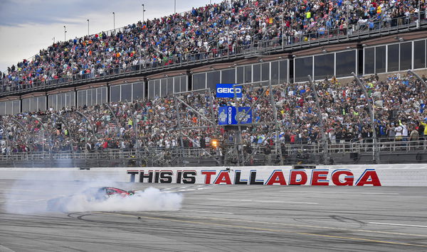
LINCOLN, AL – APRIL 23: Kyle Busch 8 does a burnout in the McLaren Custom Grills Chevrolet after winning the GEICO 500 in the NASCAR, Motorsport, USA Cup Series on Sunday, April 23, 2023 at Talladega Superspeedway in Lincoln, AL. Photo by Austin McAfee/Icon Sportswire AUTO: APR 23 NASCAR Cup Series GEICO 500 EDITORIAL USE ONLY Icon230423021
The year 2024 is set to break new ground with not one, but two superspeedway showdowns making their way into the Playoffs. The Talladega Superspeedway will be taking the spotlight on Sunday, October 6, for the fifth playoff race following the spring race in April. The anticipation is actually sky-high, especially after last year’s [April] edge-of-your-seat finish where Kyle Busch clinched victory in the final laps, leading for just a trio of them.
But before the rubber hits the road, there’s a bit of a stir in the stands. It seems the NASCAR faithful are not happy with a major makeover that has taken place – a logo refresh. Ahead of the spring race in 2024, Talladega Superspeedway rolled out its new facade. Speedway chief Brian Crichton touted the revamped logo as a leap into the future, aiming to steer the speedway into the next century.
ADVERTISEMENT
Article continues below this ad
Talladega Speedway’s new logo makeover hasn’t exactly been a hit with the NASCAR crowd
The aim of the logo revamps was to amp up everything that puts Talladega on the map – a place where only the bravest dare to tread and where champions are carved out in NASCAR’s fiercest battles. “Talladega Superspeedway has always been known for providing intense racing and the evolution of our logos reflect our history well. The new logo will display our passion for edge-of-your-seat racing while honoring the tradition and legacy of all those who helped shape what Talladega has become today,” Talladega boss Brian Crichton explained.
The new emblem is going to splash across signs all over the superspeedway, capturing the essence of this hallowed racetrack. As per the Speedway- It’s a salute to the track’s daring vibe and storied past, with a color palette of black, gray, and red that nods to the original logo’s era from 1969 to 1989. Moreover, the new shades capture the raw thrill of Talladega, crafting a visual saga that mirrors the speedway’s breakneck pace. The standout ‘A’ in the logo isn’t just for show – it’s a nod to the razor-edge finishes Talladega’s known for, symbolizing the speed and finesse needed to master its curves.
NASCAR royalty like Dale Earnhardt Jr, Donnie Allison, and Vice Chairman Mike Helton had a hand in shaping the new symbol, ensuring it honors Alabama’s deep-seated racing roots.
Talladega Superspeedway has a new logo: pic.twitter.com/eDtQEoyhKz
— Bob Pockrass (@bobpockrass) February 7, 2024
Alongside the primary logo, there’ll be secondary designs for merch and more, including nods to Alabama’s pride with “DEGA” emblazoned bold and proud. The unveiling was a star-studded affair with past victors David Ragan and Red Farmer, plus Bret Holmes, in attendance.
Yet, despite the fanfare and all the hype, the new design hasn’t won over many, who’ve been quick to critique it for lacking originality, poking fun at the speedway’s latest creative direction.
Watch This Story: NASCAR News Dale Earnhardt Jr Reacts as Insider Triggers Vicious Talladega Memory
Trending
Superspeedway’s latest branding move has become a bu** of jokes among NASCAR fans
As soon as Bob Pockrass shared the post revealing the new logo of Talladega, fans flocked in to mercilessly bash the creativity of the Talladega team. It started with, “I just don’t understand, if you’re gunna rebrand don’t end up with a more boring logo for one of the most exciting tracks. The old logo was awesome,” and spiraled into a chorus of “Boooo! So generic.” A fan asked everyone to collectively protest against the new logo so that the authorities change it straight away- “Let’s all hate on it so they change back!”
ADVERTISEMENT
Article continues below this ad
Built to be big. Built to be bad. Built to be fast. A new look but the same intense racing! pic.twitter.com/MCmj49HCR1
— Talladega Superspeedway (@TALLADEGA) February 7, 2024
ADVERTISEMENT
Article continues below this ad
Another fan’s mere “Meh” was enough to show his displeasure. A few other comments read, “Middle schooler could’ve made this…where’s the creativity??” followed by a long “NOOOOOOO” by another die-hard. One fan simply stated how the previous logo was much better than the revamped one saying- “they really just ruined what was perfection…” Sharing the same sentiment, another said, “How to go from goat to mid … Alabama’s new motto.”
Looks like the revamp hasn’t been able to work the magic that everyone was hoping for. Well, did you like the new Talladega logo?
ADVERTISEMENT
ADVERTISEMENT
ADVERTISEMENT
ADVERTISEMENT


