via Getty
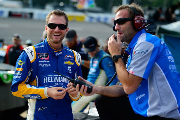
RICHMOND, VA – SEPTEMBER 21: Dale Earnhardt Jr, driver of the #88 Hellmann’s Camaro Chevrolet, stands on the grid during qualifying for the NASCAR Xfinity Series GoBowling 250 at Richmond Raceway on September 21, 2018 in Richmond, Virginia. (Photo by Robert Laberge/Getty Images)

via Getty
RICHMOND, VA – SEPTEMBER 21: Dale Earnhardt Jr, driver of the #88 Hellmann’s Camaro Chevrolet, stands on the grid during qualifying for the NASCAR Xfinity Series GoBowling 250 at Richmond Raceway on September 21, 2018 in Richmond, Virginia. (Photo by Robert Laberge/Getty Images)
With the conclusion of the 2023 NASCAR Cup Series season two weeks ago, the refurbishments have begun. From teams to race tracks to car manufacturers, organizations look forward to getting into the best possible shape before the start of the new season. With Toyota and Ford revealing new looks for the Camry and the Mustang, the onus is now on race tracks like Richmond Raceway to deliver an optimal racing product.
The majority of the ownership of racing venues is held by Speedway Motorsports and International Speedway Corporation. The ownership grants these corporations the right to implement changes in the track and their public image. ISC-owned Richmond Raceway has joined the preparations for 2024 with a new reveal of the venue’s logo. However, change is something other than what NASCAR fans are particularly fond of. The fandom doubts the rebranding, and even NASCAR legend Dale Earnhardt Jr has joined the fray.
ADVERTISEMENT
Article continues below this ad
A new look under the stars for Richmond Raceway
Earlier today, Richmond Raceway officials announced a major revamp in the venue’s operation. A new logo that features the D-shaped oval beside the James River was unveiled. Additionally, the presence of the stars in the rebrand depicts a return of night races to the raceway.
Richmond Raceway will host night races for the first time in 5 years. Since 2019, night races have been a big miss for the track, and their return has also delighted the community. Two races have been designated for the raceway, including one on March 31, which is, incidentally, Easter Sunday. August 11 will see the second iteration of the night race.
Track president Lori Collier was pleased to announce their new logo, signifying Richmond’s cultural importance on the NASCAR map. She stated, “Richmond is the cradle of American racing, where upstarts have dared to be legends and legends have driven to stardom. These new logos are a perfect representation of that bold Richmond spirit that defines our commonwealth and our sport.”
New Richmond Raceway branding unveiled pic.twitter.com/7IbFaWO8j3
— Matt Weaver (@MattWeaverRA) November 15, 2023
Another great but underlying compliment of the new logo is the reference to Richmond’s motto, which can be seen in the city seal. The motto, sic itur ad astra, implies “to the stars” in Latin and accurately represents the stripes reaching for the stars.
Read More: “Slightly Less Ugly Tesla”- Racing Fans Pass Harsh Verdict on Toyota’s 2025 Hybrid Camry Reveal
The Richmond Raceway official Twitter handle unveiled the new look after a long track polish. While there are so many positives about the rebrand, NASCAR fans have pointed out monotony in the logos of NASCAR tracks. Their anguish is understandable, with SMI and ISC at the heart of these rebrands.
Trending
The NASCAR community is unsure how to feel about the rebrand
Renowned NASCAR journalist Matt Weaver sided with the fans who have ridiculed the International Speedway Corporation for their lack of creativity. ISC logos for NASCAR usually have an essential element in the logo that depicts a characteristic of the host city. Homestead-Miami Speedway‘s logo shows a beach and a coconut tree, which aligns with the track’s location. Similarly, for Phoenix, the logo presents a big cactus plant in the middle of sandy dunes, showcasing Arizona’s dry, barren, and scorching state.
When a fan pointed out the repetition of the theme in the rebrands, Weaver replied, “Wait until you find out how Speedway Motorsports brands its properties!” Dale Earnhardt Jr chimed in with a GIF that affirmed Weaver’s opinion. Being a connoisseur of the sport, Junior has often paid great attention to these minute changes in NASCAR.
— Dale Earnhardt Jr. (@DaleJr) November 15, 2023
Team AlphaPrime’s No. 43 driver in the Xfinity Series, Ryan Ellis, voiced his excitement over the track’s renovation and a fresh look. The night races’ return has excited the drivers to race on it. Even more so for Ellis, who will be speeding under the stars on his home track.
Commending the renovation and accepting the changes, one of the fans commented, “Who said a refreshed look won’t bring a spruced-up adrenaline rush? It’s high time we started embracing change instead of blaming it.” The fanbase has been divided following the major reveal. While some look forward to the new changes, others are still unsatisfied with them.
need swag to rep my home trackkkkkk
— Ryan Ellis (@ryanellisracing) November 15, 2023
ADVERTISEMENT
Article continues below this ad
“Everyone copying homestead, eh” commented another fan, pointing out the similarity in logo designs, while another person was very crude in his opinion and stated, “Fire the marketing person”.
The quality of racing has been a concern over the past few years at Richmond. The 2023 regular season race at the venue could have been better regarding close-quarter action and leader changes. One of the fans hinted at the same as he wrote, “Rebranding the logo is cool, but y’all need to fix the track surface.”
“That sucks!! The old was much better!!”, “I like it. It’s similar to Homestead and Michigan’s new logos. ISC track logos are always better than SMI.” were some of the other comments that displayed a mixed reaction from the fanbase.
ADVERTISEMENT
Article continues below this ad
Watch This Story: The $75,000 legacy: Dale Earnhardt’s priceless memorabilia
The logo in a way accurately depicts what the city and its culture stand for. A subtle reference to the city seal and motto surely adds a new dimension to track logos. As for the fandom, it is hard to impress everyone, most certainly NASCAR fans.
ADVERTISEMENT
ADVERTISEMENT
ADVERTISEMENT
ADVERTISEMENT


