via Imago
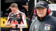
NASCAR, Motorsport, USA Daytona 500, Feb 21, 2016 Daytona Beach, FL, USA NASCAR team owner Joe Gibbs during press conference, PK, Pressekonferenz after the Daytona 500 at Daytona International Speedway. Mandatory Credit: Mike DiNovo-USA TODAY Sports, 21.02.2016 18:23:27, 9129065, Joe Gibbs, NPStrans, Daytona International Speedway, Daytona 500, NASCAR PUBLICATIONxINxGERxSUIxAUTxONLY Copyright: xMikexDinovox 9129065
Joe Gibbs’ descendant has come a long way in racing. Ty Gibbs started competing full-time in the Cup Series in 2023, and in 2024 he cracked the playoffs. Before that, he amassed 11 Xfinity Series race wins across 2021 and 2022, along with a Series championship. However, amidst that resounding success lies a tragic tale of the Gibbs household – one they are unwilling to let go of easily.
Ty’s father, Coy Gibbs remains a treasured memory for Joe Gibbs Racing. He raced in Xfinity and Trucks for the team in 2001-2003 and also served as the vice chairman and chief operating officer until the end of 2022. Now, JGR is making efforts to immortalize his life – although fans misunderstood its intentions.
ADVERTISEMENT
Article continues below this ad
Joe Gibbs offers a heartfelt tribute
Before scripting his success as a dual-sport Hall of Famer, Joe Gibbs rode bikes. The North Carolina native spent his younger days riding “Maicos and CZs” during the ’50s and ’60s. He passed on this love to his sons J.D. and Coy, one of whom made a business out of the hobby. Coy Gibbs operated the JGRMX team, or the MotoCross segment of JGR, from 2008 to 2020. It clinched a prestigious win at the season-opening Anaheim 1 in only its second year in the AMA. Although its 12-year run did not achieve the success imagined, Coy Gibbs left marks of his contribution to the team.
Coy Gibbs passed away on the same day that his son Ty clinched the 2022 Xfinity Series championship. In January 2023, Joe Gibbs hired Eric Schaffer as the team’s EVP/Chief Commercial Officer.
As the family was in mourning, Schaffer uncovered a treasured piece of memorabilia in JGR – a logo for the old motocross team that Coy Gibbs had designed years ago. The piece brought warmth to the Gibbs household, and in March 2024, they declared it as their alternate logo. Now Gibbs has taken it up a notch, and changed his NASCAR race team’s official logo to the one Coy envisioned a long time ago.
#NewProfilePic pic.twitter.com/MFfepOdur7
— Joe Gibbs Racing (@JoeGibbsRacing) January 6, 2025
The new emblem features bold and black ‘JGR’ lettering. This starkly contrasts the previous traditional logo that featured a ‘checkered flag’ and ‘initials in crimson’. “It’s an ode to Coy,” Schaffer said. He continued that the emblem symbolizes Coy Gibbs’ continued presence in the family. “For Christmas, [Heather] wanted the logo t-shirt that all of the Xfinity drivers wore. She wanted it for all of her kids and that kind of thing. It’s a big deal. If it makes them smile and think about Coy, it’s a great add-on in addition to being something that is hopefully good for our company, and fun and new and hopefully adds something.”
What’s your perspective on:
Is the backlash against JGR's logo change justified, or are fans missing the emotional tribute?
Have an interesting take?
However, the NASCAR community criticized the logo, oblivious to Coy Gibbs’ memory.
Trending
ADVERTISEMENT
Article continues below this ad
Fans address the wrong side
Well, Joe Gibbs Racing has embarked on a series of changes for 2025. The team recruited William Sawalich and Taylor Gray to drive full-time in the Xfinity Series. Ty Gibbs has assumed ownership of the No. 54 Xfinity car, and Martin Truex Jr. has retired. However, this sudden emblem change did not elicit the best reactions from fans, who dubbed it a downgrade – clearly ignorant of Coy Gibbs‘ relevance. “Bruh why the old logo was great. No need to fix what isnt broken.” Somebody else also expressed their sadness for the dumped older logo, which was more attractive. “Old logo is waaaaaaay more creative and iconic. This trend of over simplified logos is very boring.”
The lack of high-resolution in the newly dropped logo also bugged fans. Somebody was tired of sports rapidly adopting new trends that had no appeal without a warning. “For the love of god. Can organizations in all sports stop getting rid of logos that have personality for cookie-cutter soulless things like this?” Another fan pointed out a zoomed-out picture of the logo, in which pixels were visible. “Y’all got any more pixels?” Hollywood personalities have higher fame than the common person, and so did JGR’s previous logo over the new one. One fan wrote, “This is like going from dating Ana De Armas, to Stacy in accounting.”
Even amidst this disrespect and oblivion, some fans understood the true meaning of the logo change. Somebody accurately pointed out the history behind it, while also underlining an advantage. “For those that don’t know, this is the font Coy Gibbs used for their MX team logo. It’s a nod to the family heritage while also making their logo look more legible at a smaller scale. The old logo was hard to read at a distance on the nose of the car; this will be more legible.”
ADVERTISEMENT
Article continues below this ad
Clearly, it will take time for people to get a grip on the situation. Joe Gibbs’ logo revamp is a noble tribute to his son Coy, whose memory will stay immortal.
ADVERTISEMENT
ADVERTISEMENT
ADVERTISEMENT
ADVERTISEMENT


Is the backlash against JGR's logo change justified, or are fans missing the emotional tribute?