

Every single time a team drops their new uniform, one thing you can count on is divided opinions from the fan base. And that’s exactly what happened when the San Francisco Giants dropped a teaser of their latest uniform. Built on movement, rhythm, and reinvention, the new uniform was supposed to make a statement. But instead, it just invited underwhelming reactions from the Giants’ nation.
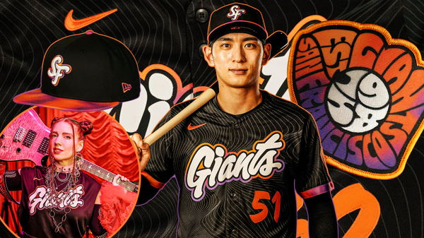
Hours before their first pitch against the Cincinnati Reds at Oracle Park, they unveiled their new uniform—City Connect 2025: The Remix. The intent behind the theme was to reflect on the rhythm and energy of music. The kit is wrought in a sophisticated black color with “Giants” splashed in a dramatic font, wired in bright orange and a dash of purple. The cap, too, delivers a modern twist with the “SF” logo.
The City Connect uniforms were originally launched by MLB X Nike back in 2021. Their primary vision was to reflect on every team’s city culture. Interestingly, that’s why even the Giants’ latest uniforms have a backstory. The hint of purple in the jersey is supposed to evoke the shine of Fillmore’s stage lights as well as Haight-Ashbury’s posters. That’s not all; it also signifies the franchise’s New York origins, from when the Giants had a hint of violet from 1913 to 1917 as a nod to New York University.
ADVERTISEMENT
Article continues below this ad
City Connect 2025: The Remix – A uniform layered with movement, rhythm, and reinvention pic.twitter.com/ZkvLGou7ht
— SFGiants (@SFGiants) April 8, 2025
Further, if you notice closely, the jerseys also have a glove patch on the sleeve – inspired by warped 1960s gig posters. Fans get to witness them wearing these uniforms at their City Connect concert games as well, with the Giants’ have officially retired their previous ‘Creamsicle’ uniforms, which lasted for three seasons.
However, all said and done, the Giants’ new uniform just wasn’t enough to completely woo their fan base. While some fans commended their creativity with the theme, most of them simply criticized it.
The backlash on the SF Giants’ latest uniform
When the San Francisco Giants dropped the teaser of their uniform, it also dropped the jaws of the entire Giants’ nation. Undoubtedly, the cultural history behind the jersey was remarkable, but according to many, it wasn’t executed well. The fans didn’t hold back on their judgments and negative remarks. They were simply underwhelmed.
What’s your perspective on:
Did the Giants' new uniform miss the mark on celebrating San Francisco's legendary 60s counterculture?
Have an interesting take?
Some believed that for a city being the cradle of the psychedelic art scene, this jersey simply missed the opportunity to celebrate the roots of San Francisco. A fan commented: “San Francisco is literally the birthplace of 1960s art and music counterculture. The potential here is endless—and this is what we end up with?” San Fran, in the 60s, gave rise to many legendary icons – like Jefferson Airplane, Janis Joplin, Jimi Hendrix and the Big Five collective.
Some fans believed that since this jersey was built on the idea of reinvention, it didn’t meet the expectations. Others who were disappointed with the color palette used simply threw sarcastic jabs at the entire franchise – comparing them to kid’s cartoons. One fan weighed in: “Brought to you by the sponsors at Nickelodeon.”
ADVERTISEMENT
Article continues below this ad
Many agreed with this X user that such vibrant visuals had landed too far from the elegance. But then, one pragmatic fan focused on the big picture: “Jerseys are ugly a- and the hats are decent. None of this matters as long as they keep winning”. Well, they have gotten off to an incredible 8-2 start, landing them in P3 in the NWL behind the Dodgers and Padres.
So let’s just say, if the Giants’ keep winning wearing these jerseys, it’ll be the last thing fans will criticize. But till then, one shocked fan was too taken aback: “Is this an April fools joke?” Clearly, the expectations with the Giants’ uniform were sky-high and they didn’t meet them. Another fan responded to the uniform unveiling with a cutting, no-words-minced reaction, reflecting the constant mood of the entire Giants’ nation: “Dammit that’s awful. Legit buzz k—“.
It’s fair to mention that fans were too emotionally invested in the Giants’ previous ‘Creamsicle’ uniforms and this remix-themed jersey didn’t do them justice. Hopefully, this criticism will blow over as soon as the fans witness the San Francisco Giants’ thriving. And if they manage a winning streak with this kit? Let’s just say fans will have a new favorite lucky uniform.
ADVERTISEMENT
Article continues below this ad
ADVERTISEMENT
ADVERTISEMENT
ADVERTISEMENT
ADVERTISEMENT
Did the Giants' new uniform miss the mark on celebrating San Francisco's legendary 60s counterculture?