

Since 2021, MLB teams have tried to express their creativity and love for their home cities through the “City Connect” program. Though that program has led to some beautiful jerseys, there have been many that have proven to be highly unpopular with fans. Now the Los Angeles Dodgers have found themselves on the latter side. Their fans do not like their new jersey and have made their voice heard.
Fans looked with anticipation (and a little fear) when the Dodgers announced their second wave of City Connect jerseys. Anticipation is natural, but the reason for fear was simple – the City Connect outfits haven’t been impressive this season. Ironically, what makes these jerseys important is also what makes it difficult for them. The teams can get creative but the people of the city might not like seeing something that is “inspired” by them.
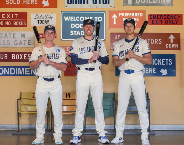
However, one can see that the Dodgers’ City Connect jersey has a lot of things going for it. For instance, the front wordmark is inspired by the signage of the LA Memorial Coliseum, the first home of the Dodgers in 1958. And the upward trajectory of the contract intends to represent the city’s pursuit of the beyond.
ADVERTISEMENT
Article continues below this ad
City Connect threads. pic.twitter.com/w8xKNgRoFF
— Los Angeles Dodgers (@Dodgers) June 17, 2024
Other than that, the hashtag #ITFDB stands for the classic Dodgers opening chant. “It’s Time for Dodger Baseball” – the legendary words spoken by Vin Scully, the Hall-of-Fame voice of the Blue Crew. So one can see that a lot of thought has gone into making these jerseys as memorable as possible.
But even after that, the fans aren’t pleased. Something’s missing here, say many fans. However, like other City Connect jerseys this year, the fans were quite open in showing their dislike for the design.
Los Angeles Dodgers fans unimpressed with the design
It isn’t new to see fans mouthing their dislike for their team’s jersey. However, this time the reason for the fans’ dislike is a bit different. “Kicking us while we’re down is crazy work,” a fan said. So why are the Dodgers down and out? Well! That has to do with the recent surge in injuries to Mookie Betts and Yoshinobu Yamamoto. That has made things dire within the Dodgers fanbase.
ADVERTISEMENT
Article continues below this ad
“This is cruel and unusual punishment,” another fan said. The issue lies in the fact that the Dodgers White is too iconic. As a result, this jersey doesn’t make them think of the “Dodgers” but instead makes them remember other brands. And that is a big no-no when it comes to City Connect jerseys.
“These look like USA soccer jerseys. Very lazy designing,” a user commented. The fans aren’t impressed despite the jersey having a thoughtful design. The fans just don’t get the feeling of this being a Dodgers jersey. And that is a huge issue because the City Connect program talks about connecting with the city.
“All of the creative talent in LA and this is what got signed off on? These are really bad!” an angry fan wrote. A common complaint about these jerseys is that they’re too linear in color. Multiple fans wondered how this would’ve looked with navy blue pants. That would’ve certainly given this a new look and a nice contrast.
ADVERTISEMENT
Article continues below this ad
“The Dodgers should just give up with trying to do City Connect. Their standard uniforms are too iconic for anything different to be considered good,” a fan suggested. This idea has floated along the Los Angeles Dodgers fanbase for a long time. Ironically the fans can’t connect with City Connect. Instead, their true connection lies with the iconic Dodgers white. Perhaps that’s why suggestions like this are gaining momentum.
So the bad times aren’t ending for the Dodgers. With injuries starting to take their toll, the City Connect jerseys too have flopped. Now all the Blue Crew would want is a small break but as of now, they aren’t able to catch any.
ADVERTISEMENT
ADVERTISEMENT
ADVERTISEMENT
ADVERTISEMENT