via Reuters
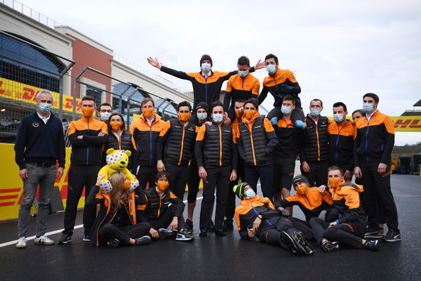
Formula One F1 – Turkish Grand Prix – Istanbul Park, Istanbul, Turkey – McLaren team members pose after the race Pool via REUTERS/Clive Mason

via Reuters
Formula One F1 – Turkish Grand Prix – Istanbul Park, Istanbul, Turkey – McLaren team members pose after the race Pool via REUTERS/Clive Mason
McLaren Racing has been racing in Formula 1 for over five decades now. The team has an incredible legacy in F1; during their most dominant era, McLaren hosted names like Niki Lauda, Alain Prost and Ayrton Senna.
To sustain for such a long time in Formula 1, a team has to evolve and adapt with time. McLaren’s logo has seen a significant overhaul since its inception. The team is tweaking their logo once again this season as they look back at the evolution of their logo.
ADVERTISEMENT
Article continues below this ad
The 2021 McLaren logo

via Reuters
Formula One F1 – Emilia Romagna Grand Prix – Autodromo Enzo e Dino Ferrari, Imola, Italy – October 31, 2020 McLaren’s Lando Norris in action during practice REUTERS/Jennifer Lorenzini/Pool
In the latest evolution, the speedmark has turned the papaya to distinguish the team as McLaren Racing. According to the report, “Modernised font style expresses our agility and speed as racers.
“While continuity is maintained with the familiar McLaren logo, the refreshed identity future-proofs our brand and optimises it for the digital environment.”
How do we look, team? 👀🧡 #NewProfilePic
Take a closer look at the latest development of our brand identity and explore the history of McLaren Racing's evolving logo. 📖👇
— McLaren (@McLarenF1) February 1, 2021
The other 21st century logos (2002-2021)
The first logo change at the turn of the century marked the high-tech surroundings of the team’s technology center. The Woking-based team retained the speedmark while redefining and updating a more stylish look.
ADVERTISEMENT
Article continues below this ad
In 2017, the outfit launched a new logo, symbolizing ‘one McLaren.’ It reflected the three different businesses and united them through the logo. The racing livery also forged the iconic ‘McLaren Orange.’

via Getty
NORTHAMPTON, ENGLAND: Lando Norris of Great Britain and McLaren F1 talks in the Drivers Press Conference during previews ahead of the F1 Grand Prix of Great Britain at Silverstone in Northampton, England. (Photo by Dan Istitene/Getty Images)
In 2020, McLaren recorded their best finish since 2012 and claimed the P3 position with 202 points. The team has since signed a proven race driver in Daniel Ricciardo and hopes to gain an advantage in the championship run. With a new Mercedes power unit, the team will hope to work towards getting back on top of the podium more often.
ADVERTISEMENT
Article continues below this ad
Do you believe McLaren’s new logo will feature itself on the top of the podium this season?
ALSO READ – Daniel Ricciardo Reveals the Most Embarrassing Moment in His F1 Career
ADVERTISEMENT
ADVERTISEMENT
ADVERTISEMENT
ADVERTISEMENT

