

via Reuters
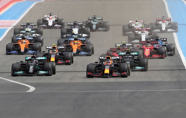
Formula One F1 – French Grand Prix – Circuit Paul Ricard, Le Castellet, France – June 20, 2021 Red Bull’s Max Verstappen, Mercedes’ Lewis Hamilton, Mercedes’ Valtteri Bottas and Red Bull’s Sergio Perez in action at the start of the race REUTERS/Yves Herman
via Reuters
Formula One F1 – French Grand Prix – Circuit Paul Ricard, Le Castellet, France – June 20, 2021 Red Bull’s Max Verstappen, Mercedes’ Lewis Hamilton, Mercedes’ Valtteri Bottas and Red Bull’s Sergio Perez in action at the start of the race REUTERS/Yves Herman
Ever since the start of this season, F1 and AWS have been rolling out certain on-screen graphics for the fans. It all started with a car performance graphic that rated each of the cars according to their straight-line speed, cornering speed, and more.
What succeeded this was the tire performance graphic that depicted the life left on each of the tires on an F1 car. While F1 garnered a lot of support from the viewers for such data, the sport recently came up with another graphic, called ‘Driver Performance Graphic.’
This made its debut at the French Grand Prix last weekend. What the graphic shows is each of the driver’s percentage of acceleration, braking, and corners.
ADVERTISEMENT
Article continues below this ad
What does the latest graphic provide?
The graphic can compare two different drivers in terms of three specific aspects – acceleration, braking, and corners. The percentage score depends on how much the driver drives his car to the limit on the track.
This data will ultimately reveal if a driver driving in a team like Williams could secure a pole position had he rather driven a car as powerful as Red Bull or Mercedes.
For instance, let’s consider Mick Schumacher, who is currently racing for Haas. And let’s say F1 decided to compare the German with Charles Leclerc, who is racing in a much pacier Ferrari. That doesn’t necessarily mean the Monegasque is faster than Mick.
Hence, the graphic shows up comparing the two; if the percentage scores of Mick are higher than Leclerc, it means Mick could perform a lot better in the Ferrari than Leclerc.
What parameters does F1 use to retrieve the data?
Rob Smedley, F1’s director of data systems, revealed that a driver driving pushing close to the limit will churn out higher performance scores in terms of his driver performance.
“Let’s look at a simple example: if driver X at the front of the grid in the best car is able to complete a lap time of 1m30s by extracting 100% of the performance of his car then if he extracts less than the maximum performance his lap times will be slower,” he said, according to Motorsport.
ADVERTISEMENT
Article continues below this ad
“In this simple example we will say that drive X extracts only 91% of the maximum performance and the result in lap time will be three seconds slower and therefore a 1m33s lap.

via Reuters
Formula One F1 – Steiermark Grand Prix – Red Bull Ring, Styria, Austria – June 25, 2021 Ferrari’s Carlos Sainz Jr. and Ferrari’s Charles Leclerc in action during practice REUTERS/Leonhard Foeger
“Now we take driver Y who is in the slowest car on the grid. In this case, driver Y is only able to attain a 1m32s lap time even when exploiting 100% of the performance of his car. On the other hand, when driver Y exploits only 91% his lap time drops to 1m35s.”
ADVERTISEMENT
Article continues below this ad
Overall, it looks like F1 is putting an end to the logic that states drivers who race at the top are the fastest while the ones racing at the bottom are the slowest. The telemetry removes the factor of car performance from the frame and focuses solely on the driver.
And it has received a thumbs up from the F1 fandom. So, will F1 and AWS work together in bringing more such on-screen graphics for the fans? Let’s hope they do!
ADVERTISEMENT
ADVERTISEMENT
ADVERTISEMENT
ADVERTISEMENT