
USA Today via Reuters
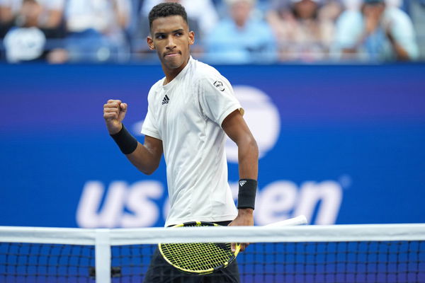
Sep 10, 2021; Flushing, NY, USA; Felix Auger-Aliassime of Canada reacts after winning a point against Daniil Medvedev of Russia (not pictured) on day twelve of the 2021 U.S. Open tennis tournament at USTA Billie Jean King National Tennis Center. Mandatory Credit: Danielle Parhizkaran-USA TODAY Sports
USA Today via Reuters
Sep 10, 2021; Flushing, NY, USA; Felix Auger-Aliassime of Canada reacts after winning a point against Daniil Medvedev of Russia (not pictured) on day twelve of the 2021 U.S. Open tennis tournament at USTA Billie Jean King National Tennis Center. Mandatory Credit: Danielle Parhizkaran-USA TODAY Sports
The dynamism of the tennis world is amplified by the unique branding strategies of its players and rookie talent Felix Auger-Aliassime is no exception. Recently, he unveiled his logo – an apt minimalistic representation of his initials ‘FAA’. The 22-year-old Canadian athlete now joins the ranks of those whose mark extends beyond the court. Indeed, this idea of playing to the beat of one’s drum evokes fond memories of Roger Federer, as his logo-focused branding campaign has opened doors for many. Thus unveiling his logo, Auger-Aliassime is walking down a familiar path as the Swiss Maestro – creating a legacy of his own.
Tennis superstars have not only demonstrated their illustrious athleticism but have also crafted their brands. In 2006, Roger Federer caused a stir with his bold ‘RF’ logo, which has since then become synonymous with his illustrious career. Continuing this brand-building trend, young phenom Felix Auger-Aliassime has recently unveiled his logo. The tennis ace is prepared to embark on a new, exciting chapter in his professional journey.
Felix Auger-Aliassime unveils personal logo similar to Roger Federer’s fan-favorite logo
ADVERTISEMENT
Article continues below this ad
The young Canadian tennis player has boldly unveiled his very own personal logo. According to the Tennis.com news report, it is a stylized representation of his initials ‘FAA’ – to mark a new chapter on his professional journey. This logo not only speaks volumes about his identity and ambitions but also reflects Auger-Aliassime’s gratitude toward fans for the unwavering support he has received.
The Canadian star’s logo enables him to stay ambitious in pursuing his dreams while maintaining humility in his accomplishments. In 2006, Roger Federer began a legacy that Auger-Aliassime is now forging.
View this post on Instagram
Auger-Aliassime’s new logo will serve as an impressive visual icon on merchandise, promotional materials, and digital platforms, thus strengthening his brand and connecting him more deeply to his fan base. Speaking symbolically, the logo encapsulates Auger-Aliassime’s ongoing process of growth and development.
ADVERTISEMENT
Article continues below this ad
From his spectacular debut as a young prodigy to his rapid rise in the international tennis rankings, it celebrates the hard work, commitment, and perseverance which have brought him here. It also boosts Auger-Aliassime’s expanding brand, much like what Federer did in 2006.
Federer’s iconic ‘RF’ Logo is a symbol of identity and reunion
The ‘RF’ logo, synonymous with tennis legend Roger Federer and beloved by fans, has a captivating backstory. Originally designed by his wife, Mirka Federer, for a perfume in 2003, the logo gained new life when Nike adopted it as part of Federer’s brand. Despite Federer’s split with Nike in 2018, the logo remained under their trademark until 2020, allowing the sale of remaining merchandise.
ADVERTISEMENT
Article continues below this ad
WATCH THIS STORY- From Serena Williams to Chris Hemsworth: Celebrities Lured by the Glitz and Glamor of Monaco
Federer, in collaboration with Uniqlo, created a new logo during this period. However, in a triumphant reunion, Federer and his team successfully reclaimed the rights to the ‘RF’ logo. This emblem holds immense personal value for Federer and continues to connect him with his devoted fans worldwide. What do you think about two logos? Share your views in the comments below.
ADVERTISEMENT
ADVERTISEMENT
ADVERTISEMENT